Monday, May 9, 2016

Final Blog Posting


1.    Which assignment did you ENJOY working on the best? Why?
   I really like the assignments that encourage me to try and do art myself.  The color wheel,    the self portrait and others.  Those brought a challenge and put the books to real work. 

2.    Which assignment did you ENJOY working on the least? Why?
   I enjoyed the video assignments the least only because they were so time consuming.           Maybe if the videos were only 20-30 mintues each it would have been easier to manage        with a busy schedule. 

3.    How did you like using BLACKBOARD?
   I think blackboard is a great tool.  Much better than Angel.

4.    What is your opinion of the Discussion Groups in this course?
 The discussion groups through blackboard are a great way to interact with teacher and    other students in a distance learning class. 

5.    Did you participate in any of the extra credit projects in previous modules? If so, what was your opinion of them? (mandala, elgin marbles, culture, art critics)
    Everytime I saw the extra credit projects I wanted to do them but simply didn’t have the         time to do it.  With my busy schedule, if I’m given the opportunity at something being             optional I’ll have the greatest intentions to do it but when it comes to managing the time to     actually get it done, I always opt out because it’s optional.

6. If you had the opportunity to change this course:
What would you keep?  
      I would keep it all.  The class really touches a lot of different angles and keeps us       involved. 

What would you remove?  
       I wouldn’t really remove anything, maybe less video assignments and add some       different hands on ones.

What would you add?  
      I really like the videos that we got to see artists actually doing the work, hands             on.  Rather than a lecture style video, these were better to look at as it seemed to       be more relatable to what was read in the book. 

7.  Would you recommend this course to your peers?
             I would definitely recommend because this is a great learning experience.

8. Please list any other comments you would like to share.

I am definitely overall satisfied that I took this class and I learned a lot.

Final Module - AED 200

   1.       What were you expectations for this course and where they met?
          My answers to this question at the beginning of the year for both the blog and the discussion               were the same, I just said I want to learn more about art.  To me art is something you hang on a           wall if you like it.  Making art is something that takes talent that I don’t have so I never really             worked at it.  And art appreciation is something I never understood and didn’t know how to                 break down a piece of art.  These expectations were met.  I can now look at a framed picture on           the wall and know what they style was and how to better interpret it.  I can understand the color           and lighting of it.  Same with sculptures and other forms of art.

  2.       Now that you've been through this course, What is art? How would you define it now compared          to your intial posting?

         I characterized art as something that is a picture.  A drawing, painting or graphics.  After this              course I realize that art is much more than that.  Art is all around us.  The styles of buildings,              both ancient and modern is art.  Things on TV and radio is art.  Almost everything around us              has some art to it, not just the things you see at a art gallery.

  3.       Who was your favorite artist in your original posting and who is your favorite visual artist now?          If there is a difference, why do you think so? If you have the same favorite artist, why do you              think so?

         Initially I had confessed that I really did not have a favorite artist at the beginning of the                      course.  Having gone through the course I realize that I still cannot say that I have one that is              my favorite still.  Having kind of just looked into art for the first time I can honestly say that                they all attracted me.  All the styles and artists.  Having never even thought about it before I                now know that I like it all.  The only thing that attracts me more is ones with color that is bright          and well blended.

  4.       Now that you've completed this course, how do you feel about taking an online course? Is your            answer the same as it was in your first posting? How is it the same or different?

         With my work schedule I really prefer online courses.  It’s a great way for people like me, in my          40’s, to have the opportunity to work and further my education at the same time.  I have one                class left to take and it will be a 6 year journey for a Bachelors degree but I would not be able to          do it without online classes that I can work around my schedule.

Wednesday, May 4, 2016

Module 15 - Self Portrait

My three inspirational choices:


Artist: Rembrandt
Title of work: Self Portrait with Velvet Beret
Media: Oil on Oak Wood
Date: 1634
Size: 47.5 x 58.3 cm
 Source of picture (URL): https://www.google.com/culturalinstitute/u/0/user-gallery/pwLCl2yb0RpEKw?projectId=art-project&position=0%3A4


Artist: Diego Rivera
Title of work: Self Portrait
Media: Watercolor on Paper
Date: 1954
Size: 261 x 295 mm
 Source of picture (URL): https://www.google.com/culturalinstitute/u/0/user-gallery/pwLCl2yb0RpEKw?projectId=art-project&position=0%3A4


Artist: Vincent van Gogh
Title of work: Self Portrait, 1887
Media: Oil on Artist’s Board
Date: 1887
Size: 41 x 32.5 cm
 Source of picture (URL): https://www.google.com/culturalinstitute/u/0/user-gallery/pwLCl2yb0RpEKw?projectId=art-project&position=0%3A4


Artist: Walter Sidor
Title of work: Self Portrait,
Media: Lead on Paper
Date: 2016


1. Why did you select the inspiration pieces?
I picked the 3 inspirational pieces because this is what I think of when I think of a self portrait.  I
think of a painting version of a what a picture would look like.  Also, just the head to torso, not the whole body and nothing behind it other a background. 

2. Why did you select the media to create your self-portrait?
I picked pencil on paper because, like the answer to the first question, this is what I think of as a self portrait, a picture that is drawn.  For reasons of my personal skill set, I choose to keep it black and white and not use paint or other medium.

3. What challenges did you face in creating your self-portrait and how did you overcome them?
My biggest and really only challenge was to draw the portrait to look like myself.  Drawing facial features has always been a skill to elude me and I never agree that it actually looks like what I want it to look like.

4. How does this piece represent you?
I think it represents me well.  I usually wear a hat of some kind so I choose to take the picture with me wearing a hat.  My facial features I did to the best of my ability.

5. What elements and principles of art did you apply in this work?
I used shading with the pencil to have different levels of black to show different shades of myself.  I used line to show where my eyes were directing the viewer.  That is what I believe I used.

6. Did you enjoy working on this project?
I did enjoy this.  As I’ve said a few times in this response and other blog postings, I have always struggled drawing faces and the practice and taking my time help me work on it and get a little confidence.

7. What do you think of your final artwork?
I’m certainly happy with the final product, it’s something I can look back on in the future.


Monday, April 25, 2016

Project #4 - Reflection

Reflection - Walter Sidor

Going into work on this module I was set that I was going to do my project on classic art style, most likely abstract.  But watching the videos for this modules video blog I was really impressed with the Tate Modern museum.  The way they had created that museum with all modern art in that big huge space was really cool.   It was the look on the spectators at the museum that I liked the most.  In the videos we've seen this semester the spectators normally had serious looks on their face seemingly deep in thought.  The people at the Tate had smiles on their faces, had looks of wonder and amazement.  To me that is art that is interesting.

While I like the Tate's modern art I wanted to pick something that grew up during my lifetime but still had similarity to the modern era.  In the first video it covered what they called lowbrow art, the comic themes they covered, the bright colors and crazy shapes and formations were something I also really liked so I wanted to do something that worked for both.  I picked pop art because it has similarities with both.

I struggled a little finding artist who fit this them while looking through Artsor alone.  But the hunt was fulfilling in the fact that I got to peruse so many works to find what pleased me.  To be quite honest, I have a busy life and art is not really a part of it.  After this class I probably won't go out of my way to see do what I did for this project which makes the time spent even more fulfilling.

Mod 13/14 - Video Blog

The Lowdown on Lowbrow: West Coast Pop Art

1.    For each video list/discuss the key concepts you learned.
Lowbrow is something I’ve never heard of prior to this class.  From the paintings in the video I definitely like it because it seems more modern and very much more brightly colorful.  They seem to use the term lowbrow as opposed to surreal or surrealism.  They also put rock posters into this classification, the types of posters with the big colors and the psychedelic images.  It’s very reminiscent of what I relate to as graffiti art.  Lack of Lowbrow art museums, most are highbrow. 
2.    Do the videos relate to the creation of your Art Exhibition project? If yes, explain how. If no, explain why not.
          This video does not relate to my exhibit.  I’ve chosen an exhibit that would be                         highbrow.  An exhibit that is what is considered normal.  The art in this video is out of             the norm and wouldn’t be a normal exhibit.  What I did get from it was seeing how so             much different art from this lowbrow style can be put together and work together.

3.    What is your opinion of the films? Do they add depth to understanding of the art concepts you practiced while creating your curation project?
What I like best about this video is learning more about something I’ve never heard of.  The images in the videos were familiar to me.  The Grateful Dead posters, the comic type of pictures, and all the lowbrow art seems to be things I’ve seen before and like.  For the curation project itself, I did not get any help from this video for that.

Tate Modern is 10!
1.    For each video list/discuss the key concepts you learned.
Modern art galleries is the main focus.  Vastness in art display.  Tate Modern gets 5 million visitors a year.  Has a lot of hands on art, slides, balls, ropes, and other interactive items.  Popularism had now joined intellectualism.  They changed warehouses into art museums, giving a lot of space and big structures.  They took 7 years to create the space of Tate Modern before it opened.  Gallery had white walls hung with art in a non-pattern type of way and white podiums, with art on top encased in glass.  They explained opening the modern art museum as ground breaking and kind of risk taking.  Only 10 installations put in the huge turbine hall over the years, the hall was a huge beautiful space to show art.  They talked about the people who go to museums take away their personal experience from the museum.  The entire collection of Tate Gallery tells a story and it’s up to the viewer to make their own.

2.    Do the videos relate to the creation of your Art Exhibition project? If yes, explain how. If no, explain why not.
         This one definitely related to the Exhibit project.  It tried the best it could to show the              view not only what the gallery looked like 10 years after the opening but what the                  curators went through to create the gallery.  It showed a lot of the different rooms that             hold art and showed the detail that was put in to make it a likable experience for the              viewer.

3.    What is your opinion of the films? Do they add depth to understanding of the art concepts you practiced while creating your curation project?
This one does add depth.  This museum seemed to have taken a giant leap from the regular art museum to what they thought the people wanted, a modern museum.  A lot of art is risk taking and they did exactly that with this museum.

An Inquiring Mind: Phillipe de Montebello and the Metropolitan Museum of Art
1.    For each video list/discuss the key concepts you learned.
Right from the beginning the lady explained curating as explaining the works and placing them in time and place.  A museum is never finished.  Do not fill gaps with representative examples.  Need to get only the truly outstanding works.  The Met has curators for each specialty of art so they are experts in that form.  The video covered how Montebello took the Met from a narrow focus of art to a wide focused world art collection.  The techniques covered for refurbishing the art they find were vast, they even used NYC tap water and x-ray machines to work on the art.  This museum went with yellow walls and seemed a little more crowded on the walls than the modern museums. 
2.    Do the videos relate to the creation of your Art Exhibition project? If yes, explain how. If no, explain why not.
This video also related to the project.  This one not on how to create an exhibit but how to improve it and how to keep working at it.   It seems with this video that the museum is ever evolving and growing, and that they keep working very hard to improve it as much as they can.
3.    What is your opinion of the films? Do they add depth to understanding of the art concepts you practiced while creating your curation project
          This film added depth.  It showed a museum that was the opposite of what the Tate               museum was.  This one was focused on great works of art from all over the world and            that were classic pieces.  Tate conversely focused on the modern art. 


Monday, April 18, 2016

Module 12 - Video Blog

Uncertainty: Modernity & Art

1.    Explain why you selected each of the TWO videos you choose from the selection listed above. 
Unfortunately only two video links worked.  The others brought me to a log in page that I was unsure of the credentials; the ones I tried didn’t work.
2.    For each video list/discuss the key concepts you learned.
The video covered the uncertainty of the future of art.  What will modern art look like and how will it be looked upon 30 years from now.  He calls abstract art an experiment and it is up to you to determine what it is saying to you.  For Abstract Expressionists it says that the artists expression is more morally challenging.  He points out that earlier eras had art and monuments of their war heroes, while modern art does not.  He called Jackson Pollack’s art a weightless, gravity defying, delicate dance.  Digital pictures bring artificial worlds of staged uncertainty.  A lot of pictures as art capturing the human form in many different ways.
3.    How do the videos relate to the readings in the text?
The video showed how art has evolved from early times to current art.  Modern art as was covered in the book was shown in this video.
4.    What is your opinion of the films? How do they add depth to understanding of the readings and art concepts?

The film added depth to what was read in the book by showing actual art as if it was live. 

 Abstract Expressionism & Pop: Art of the 50’s & 60’s

1.    Explain why you selected each of the TWO videos you choose from the selection listed above.
Unfortunately only two video links worked.  The others brought me to a log in page that I was unsure of the credentials; the ones I tried didn’t work.
2.    For each video list/discuss the key concepts you learned.
           The use of colors invokes responses and invokes imagination.  Unions of solid and                fluid shapes make it almost unrecognizable as to what it is to be.  Artist balances                  image and spontaneous gesture.  Action painting as form of abstract art.  Cartoon art             is abstract art.  As is things like Warhol’s soup cans. 

3.    How do the videos relate to the readings in the text?
The video clearly defined and showed what abstract art is.
4.    What is your opinion of the films? How do they add depth to understanding of the readings and art concepts?
           The film added depth to what was read in the book by showing actual art as if it was               live.  

Wednesday, April 13, 2016

Module 11 - Gallery Visit #2 - Burchfield Penny Art Center

Step 1: The Exhibition
Questions about the exhibit:
1. What is the title of the exhibit? Jack Drummer: The Effects of Time.
2. What is the theme of the exhibition?  The effects of time was the named theme but rubber seemed to be more of the actual theme.


Step 2: The Gallery
Questions about the physical space:
1. What type of lighting is used?  The main lighting for the exhibit came from small ceiling lights pointed toward the object. 
2. What colors are used on the walls?  The walls were white which made the lighting show more.
3. What materials are used in the interior architecture of the space?  The space was large.  Hardwood floors, high ceilings and white walls.  The space between the pieces was expansive enough to allow each piece to be their own entity.
4. How is the movement of the viewer through the gallery space?  The movement was around the outside.  The exhibit was more than one room but wide enough to not encourage going wall to wall but instead to suggest the best way to be staying on one wall and walking around to see all of the exhibit. 


Step 3: The Artwork
Questions about the artwork:
1. How are the artworks organized?  The artwork was organized with by having the bigger pieces occupying the
larger wall space and the smaller pieces the smaller space.  Having said that, each piece of art was large in
itself and was afforded a large space to keep it singular. 

2. How are the artrworks similar?  They were similar in the fact that they were predominately dyed and stretched
rubber.
3. How are the artworks different?  They are different in the color of dye used, the texture of the finished product
of the rubber and the shape of the canvas.
4. How are the artworks framed?  The rubber was stretched over the edges of the canvas so there was no
frames.
5. How are the artworks identified and labeled?  Each artwork had the Name and birth and death date of the
artist, the tile and year of the art, the medium of the art and finally how the art was acquired.
6. What is the proximity of the artwork to each other?  The art exhibits flowed from one to another with ample
but not too much space between.


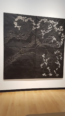
Artist: John E. (Jack) Drummer
Title of work: Untitled.
 Media: Stretched rubber with tar and rubber stitching.
Date:_2004-2006.
 Size:  96x84 inches.
 Source of picture Visit to Burchfield Penney Art Center.

            This piece stood out to me because it was black and white in color and the white parts of it stood out to the point that drew me in to take a closer look.  Looking close at it I was able to see how the white parts were pieces of rubber coming out and tied together like a bunch of little bows.  The surface of the entire piece was rough and rigid.  Without a title it’s hard for me to guess at what the artist was trying to make with this, if he was even trying for an overall shape.  But what I saw a tree leaning to the right with the white the top of the tree and the ridges in the black the trunk. 


Artist: John E. (Jack) Drummer
Title of work: Untitled.
Media:  Stretched and Dyed Rubber, 21 panels
Date: 1995-1997
Size:  102 x 300 inches
Source of picture Visit to Burchfield Penney Art Center.

            This piece was particularly likable because of the color.  Each panel of the collective piece are individual even though some colors seem to be repeated.  The hues of the color were calming in effect.  Closer look at the piece you could see the texture of the rubber and how each piece fit together.  The overall look of the piece is reminiscent of tile that you would see in a bathroom wall. 


Artist: John E. (Jack) Drummer
Title of work: Untitled.
Media:  Stretched and Dyed Rubber, two panel
Date: 1980s
Size:  60 x 90 inches overall
Source of picture Visit to Burchfield Penney Art Center.


            This piece stuck out to me mostly because it was the one nearest the title of the exhibit.  Because in this proximity I thought it may be the feature piece.  It is two panels put together.  Each panel has a blue frame-like boarder.  The right panel seems to be a dark green color roughly spread over a white canvas as the bumps of the canvas stayed white.  The left panel seems the exact opposite, white over green.  The opposite color scheme provides a little symmetry to the final product.